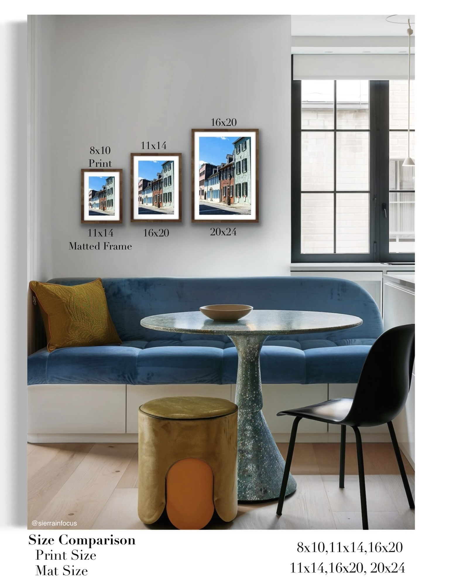

Have you ever stood in front of a blank wall, holding a beautiful photo, and wondered what size print would actually look best? You’re not alone. Choosing the right size can feel surprisingly confusing—which is exactly why I created this diagram to help make things simple.
Most prints are commonly sold in sizes like 8×10, 11×14, and 16×20. While those numbers are familiar, visualizing how they’ll fill your space is a different story. A print that looks perfect in your hands can feel too small once it’s on the wall. That’s why understanding scale is so important when designing your space.
Then come the extra decisions: mattes and frames. These elements do more than just “finish” a piece—they completely transform how it looks. A mat adds breathing room around your photo, drawing your eye inward and enhancing contrast. Choosing the right matte color can make your image feel brighter, softer, or more dramatic. Frames, on the other hand, tie everything into your room. A rustic wood frame, a sleek black edge, or a soft neutral tone can all change the mood of your artwork.
One important detail people often overlook is how mats affect sizing. Adding a mat actually increases the overall dimensions of your piece. For example, an 8×10 print paired with an 11×14 matte will need an 11×14 frame. It sounds simple, but it’s an easy thing to forget when you’re shopping.
At the end of the day, choosing the right print size isn’t just about numbers—it’s about how you want your space to feel. Whether you’re creating a statement wall or adding a subtle touch to a cozy corner, the right size, mat, and frame can make all the difference.